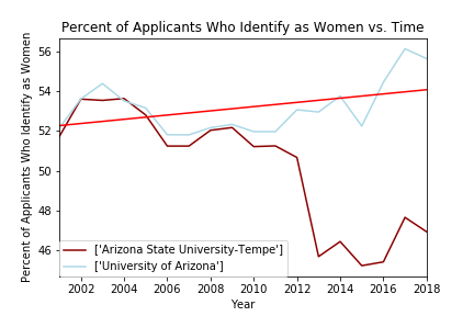
Arizona State
and
University of Arizona

The trends in this figure seem to be the most unusual of the figures presented in this site. While University of Arizona follows a more typical pattern of smaller fluctuations in women applicants throughout the years, Arizona State University has a drastic drop in women applicants after 2012. There are many factors associated with these trends, however, after researching press releases from the University around that time, I suspect that it may be related to the significant issues with the exposure of the lack of safety for women due to the publication of sexual assault claims around that time. The red line represents the regression analysis performed in the original code. For this graph:
The slope of the line is ~0.106
The correlation coefficient is ~0.434
This suggests a weak correlation between the percent of applicants that identify as the years progresssed in this time-frame. I would have expected and even weaker correlation do to the severe drop in women applicants at Arizona State after 2012.


